UX/UI DESIGN CONCEPT FOR MOBILE APP THAT MAKES GIFT SELECTION EASY
UNWRAPT
PROJECT SUMMARY
Personal project - A concept app that curates ideal gifts for your family and friends
RESPONSIBILITIES
-
User Research
-
UI Design
-
Storyboarding
-
Prototyping and testing
TIMELINE
1 month
OVERVIEW

A common problem I had observed and personally experienced; finding the right gift when you're short on time.
I was interested in investigating how people could discover gifts that were perfectly suited to gift recipients.
PROCESS

PROBLEM STATEMENT
I generated a problem statement based on my hypothesis that gift shopping can be difficult:
A person gift shopping who feels frustrated about getting the right present needs to make time to buy gifts but is time poor.
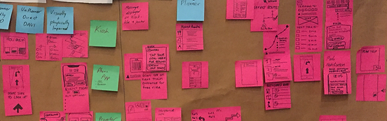
AFFINITY MAPPING
I conducted research interviews to validate that this was a genuine problem.
8 people (4 male, 4 female)
Aged between 24-67.

RESEARCH FINDINGS
I was able to distil the insights into 4 key areas.
People shopping for gifts:
-
Have trouble knowing what to buy
-
Feel awkward directly asking what someone would like to receive
-
Rely on intuition
-
Worry about disappointing the other person
-
Struggle to find the discipline to stick to a budget
-
Get overwhelmed with options
-
Are unsure of what is an appropriate amount to spend
-
Leave gift shopping too close to the date
PERSONA DEVELOPMENT
I used an empathy mapping template to assist with the creation of two personas, enabling me to keep their needs in mind when designing later on.
STORYBOARDING
I used storytelling as a way of conveying the touch points in the customer journey that were the most frustrating, and demonstrate how using the app would provide a solution to eliminate these pain points.
IDEATION
Using a blue-sky approach, our team generated a large quantity of ideas from pictures and post-its which we then pared down to the most viable.

Ideas included:
-
Push notifications alerting of disruptions ahead of the commute
-
Kiosk, PAs, signage, and projectors to assist with wayfinding in and around station areas, and connecting to other forms of transport
-
Making use of existing and emerging infrastructure
We focused on the kiosk as our main concept as the client had requested.
We presented the other concepts as additional long-term, “blue-sky” ideas that could be used in conjunction with the kiosk at busy station times.
Ideas were sorted using a prioritisation matrix to work out the most viable and feasible solutions that would have the most likelihood of being implemented in the near future.
STORYBOARDING
I communicated likely scenarios faced by commuters through lo-fi storyboards to show how problems could be overcome with the kiosk and to shine a light on other existing infrastructure that was under-utilised by Sydney Metro.
The storyboards would help us to focus on the touch points and overall experience that the personas would likely encounter toward their interaction with the kiosk.


Fred never plans his trips. He arrives at Macquarie Park station and his train to Chatswood hasn't arrived for 5 minutes. He can't see anyone on the platform and there aren’t any announcements on the twitter feed. He has had his headphones in but he can hear some sort of announcement has come through the loudspeaker. Fred goes to the kiosk and sees the delay alerts on the screen.


Cho is on her way home to Rouse Hill. She is in a wheelchair and needs the lifts. When she exits the train, she stops at the kiosk when she notices the alert:
"Due to high winds, the lifts on platform 1 at Rouse Hill station are not in service. Please make yourself known to staff at this station for assistance".
She presses the help button and someone answers. The person comes down and helps Cho up the escalator.
USER FLOWS
Based on our research, I was able to propose user flows aiming to assist commuters to find information with the minimal amount of input required from the customer.

Scenario: Fred wants to know why the train hasn’t arrived and he wants to know what he can do to get to his destination.


Scenario: Cho is in a wheelchair. The lifts are broken and she needs assistance to move up onto the concourse.
LO-FI WIREFRAMES
Lo-fi paper prototypes were based on the user flow architecture. They were tested with real Metro customers to validate if people were able to find what they were looking for quickly and easily.
Normal state

The Home screen was cluttered and functions of buttons were unclear. The destination search was inefficient.
Disruption State

The customer was required to touch the screen to obtain the specific information related to the disruption.
Customers indicated that they wanted to know about the specific nature of disruptions so we made this information available from the home screen without the need to interact.
INTERACTIVE PROTOTYPE


PROTOTYPING & VALIDATION
We built and tested an interactive figma prototype with a dozen commuters to validate our revised architecture.

We incorporated usability improvements based on feedback obtained from earlier versions:
TESTING & FEEDBACK
Customers indicated that they wanted to know about the specific nature of disruptions so we made this information available from the home screen without the need to interact.
We found that button symbols were confusing, so added words to assist in navigation which also enabled us to increase the viewable area allocated for maps and timetables.

(Click images to enlarge)
RESULTS
Minimising the amount of clicks required to get to important, time- sensitive information was particularly important in this digital product.
What worked
-
Simple text copy on buttons and simple navigation
-
Borrowing from tried-and-tested design patterns
What needed improvement
We noted that our disruption alert screen was informative but was text heavy. This could be improved with better copywriting.
